Bakeware, Tableware, Drinkware and Cookware Design Cali Drinking Glass by Florian Seidl
Packaging Design Nong Li Beer Packaging by China Resources Snow Breweries
Interior Space and Exhibition Design Snow Park Exhibition Center by Kris Lin
Packaging Design Xijiu Matured Liquor Packaging by Chengdu Times Fashion Art Design Co., Ltd
Bakeware, Tableware, Drinkware and Cookware Design Yin Mo Star Kui 4 Pieces Knife Set by Beijing Wang Mazi Technology Co., LTD
Interior Space and Exhibition Design Xingshufu Banouet Restaurant by Haodong Liu

Design of the Day A' Design Award & Competition is pleased to present you with the Design of the Day, an excellent example of good design that makes a positive change. View the Design of the Day showcase to see previously featured good design works today.

Design Team of the Day A' Design Award & Competition is pleased to present you with the Design Team of the Day, an outstanding design team that makes the World a better place with their good designs. View the Design Team of the Day showcase to see previously featured design teams today.

Designer of the Day A' Design Award & Competition is pleased to present you with the Designer of the Day, an outstanding and extraordinary designer that advances society with their good design. View the Designer of the Day showcase to see previously featured designers today.

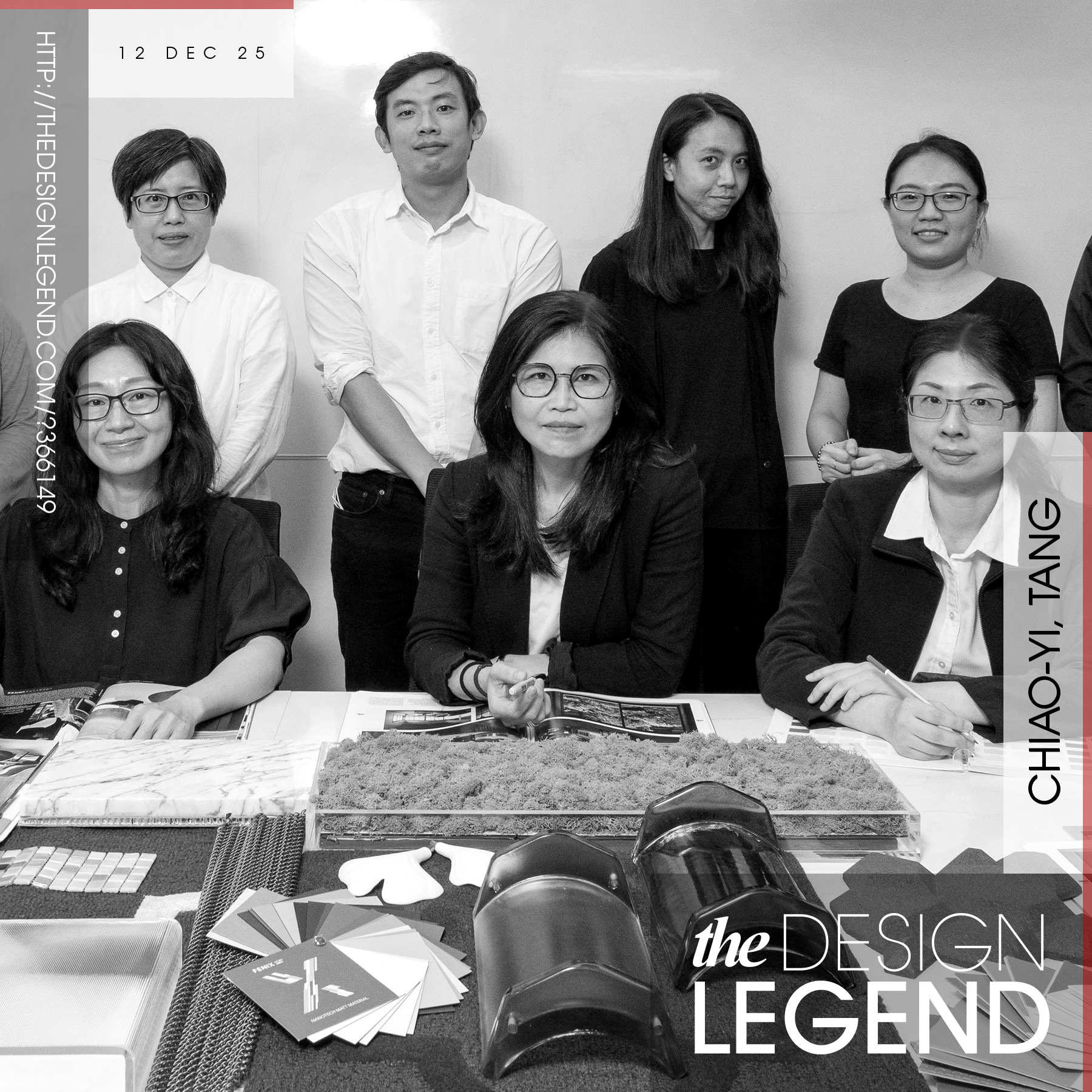
Design Legend of the Day A' Design Award & Competition is pleased to present you with the Design Legend of the Day, a true design legend that changes the world with their exceptional design work. View the Design Legend of the Day showcase to see previously featured design legends today.

Design Interview of the Day A' Design Award & Competition is pleased to present you with the Design Interview of the Day, an amazing interview about an excellent design work. View the Design Interview of the Day showcase to see previously featured design interviews today.

Designer Highlight of the Day A' Design Award & Competition is pleased to present you with the Designer Highlight of the Day, an excellent designer with outstanding design works. View the Design Highlight of the Day showcase to see previously featured designers today.
Interior Space and Exhibition Design Wen Shan Hai Moutai Experience Center by Xiang Wang
Packaging Design Moutai Dream Red Wine Packaging by Meijie He
Interior Space and Exhibition Design Huai’an Zhongshuge Bookstore by Li Xiang
Landscape Planning and Garden Design China Overseas Yongding Jiuli Residential Display Area by Beijing Miland International Landscape Planning and Design Co., Ltd. China
Social Design FOODres Food Waste 3D Printing by Yiqing Wang, Biru Cao
Bakeware, Tableware, Drinkware and Cookware Design Lena Cookware Set by Kerim Korkmaz
Interior Space and Exhibition Design Arabica Riyadh Roastery Cafe by Jun Watanabe
Interior Space and Exhibition Design Dongguan Zhongshuge Library Interior Design by Zhu Jun
Bakeware, Tableware, Drinkware and Cookware Design Joy Barware Series by Sisecam
Interior Space and Exhibition Design Royal One Private Club House by Kris Lin
Bathroom Furniture and Sanitary Ware Design Formation 01 Bathroom Faucet by Kohler Internal Design Team
Interior Space and Exhibition Design Changi Terminal 2 New Airport Langage by Basile Boiffils
Interior Space and Exhibition Design Znong Shu Ge Book Store by Masato Kure
Interior Space and Exhibition Design Melandb club Indoor Playground by Li Xiang
Interior Space and Exhibition Design Xiangcheng Paradise Walk Shopping Mall by Shen Junwei
Social Design Aquacendo Bottle by Shanghai Grand Trade Co.,Ltd.
Beauty, Personal Care and Cosmetic Products Design Ya Man Ipl Clear Shot Beauty by Chengshen Tan
Packaging Design Indian Absinthe Heritage Liqueur by Dheeraj Bangur
Packaging Design Flora Gin by Ian Wallace
Interior Space and Exhibition Design Vitality Orange Gym by Kris Lin
Interior Space and Exhibition Design Rotunda Sale Center by Kris Lin
Heating, Ventilation, and Air Conditioning Products Design Magic Cube Air Conditioning Outdoor Unit by ZHEJIANG ZHONGGUANG ELECTRICAL CO.,LTD.
Heating, Ventilation, and Air Conditioning Products Design Inno Air Louvre Air Conditioning Outdoor Unit by ZHEJIANG ZHONGGUANG ELECTRICAL CO.,LTD.
Packaging Design Guijiu 20 Baijiu Packaging by Meijie He
Packaging Design Kweichow Moutai Baijiu Packaging by Meijie He
Packaging Design Yanghe Naked Bottle Liquor Baijiu Packaging by Meijie He
Packaging Design Moutai Shengyue Flying Fairy Packaging by Yingsong Brand Design (Shenzhen) Co, Ltd
Interior Space and Exhibition Design Rose Garden Sales Office by Yongna Sheng
Computers and Peripheral Devices Design Ce5x Series Microcomputer by Changqiang Zhou
Interior Space and Exhibition Design Youngor Experien Fashion Store by Masato Kure


